


Join us February 17 for the second edition of Record Bizzy at Darling! NYC-based ATO Records will present an exclusive first listening session for Altın Gün’s new album. […]

A few weeks ago, Paradise is a Frequency teamed with Numero Group to release The Style of Life, a collection of home made R&B/soul/smooth jazz songs that maps the label’s drifting instrumental aesthetic with a little more shape than usual. The St. Louis imprint has been tracing this late-night mood through their great YouTube channel, but the double LP gives it a clearer arc. Across four sides, the pieces settle into a quiet rhythm, each track given enough space to bloom, hang in the air and dissolve without hurry. What felt intimate in digital form gains a kind of physical patience on vinyl, the sequencing closer to a slow broadcast than a compilation.
Tucked inside the package is something the rollout didn’t market. A folded insert/poster sits in the sleeve, unassuming at first then strangely clarifying once it’s opened. The images and liner notes on it distill the label’s sensibility in a single gesture and turn the release into something larger than expected, both an epiphany and a bonus.
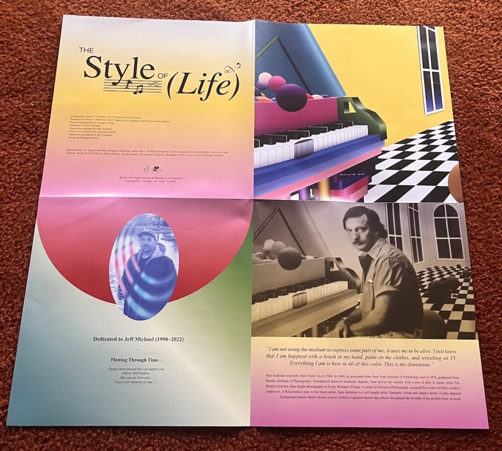
An essay is combined with notes of each record’s acquisition. The label found Bruce Sherman’s song “Slow R&B” at “video game store Fairview Heights, Illinois.” Luigi Piergiovanni’s “Coracao” was obtained through a “blind internet buy.”
As they write in the insert, “What you hold in your hands has been hiding out in homes and online, waiting to be found and re:membered through the lens of future music movements, springing forth from an ever emerging virtual space – one that’s increasingly interiorized, always provisional, and eternally under construction. The Style of Life is a trip through the 24-hour computer heaven forever on the threshold between worlds. It is sequenced like a fictional software update for your sensibilities, or a 70-minute refresh for your mind. These playful, downtempo jams are a reminder to cool off, make room for what’s right in front of you, and achieve a more leisurely paced lifestyle.”
The poster got us thinking about the idea of inserts and the ways in which they quietly expand an album’s world. Most of them aren’t treated like selling points. They sit folded inside the sleeve until someone bothers to look, then they alter the atmosphere around the record in a way the music alone can’t. Sometimes they underline a mood, sometimes they clash with it, sometimes they feel like a dispatch from whatever parallel space the artist occupies.
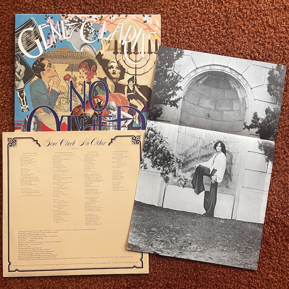
A few days before the Paradise poster arrived, an original copy of No Other turned up at the local shop with its long-lost foldout still tucked inside. The poster shows Clark in full glam tilt, styled and posed like a Roxy Music satellite, his image carrying the same charged theatricality that runs through the record. It feels less like leftover promo material and more like a small time capsule, the kind of buried insert that snaps the album’s world into sharper focus the moment it’s unfolded.
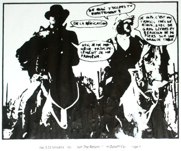
Factory’s sandpaper sleeve for the Durutti Column’s The Return of the Durutti Column gets most of the attention, but the poster tied to the release is its own odd artifact. Adapted from a 1960s French student-movement pamphlet, the black-and-white image of two mounted figures didn’t ship with the LP itself but arrived through early Factory mailings, many of which had a notorious problem: the stack was caught in a leak at the label’s space, and most copies came water stained. Factory, in its very Factory way, offered clean replacements to anyone who complained. The poster doesn’t mirror the music so much as point to the political and art-school currents around it, a reminder that this quiet record grew out of a much louder lineage.

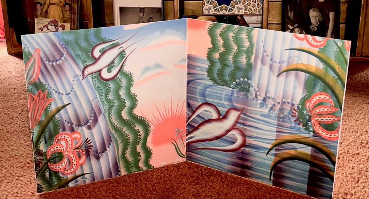
Select vinyl pressings of Tomorrow’s Harvest came with a framable art insert printed from the album’s sun-faded visual palette, a still image that feels lifted from a forgotten instructional film. Boards of Canada have always relied on suggestion rather than exposition, and the insert functions exactly that way — a quiet visual shard that deepens the record’s apocalyptic calm without calling attention to itself.
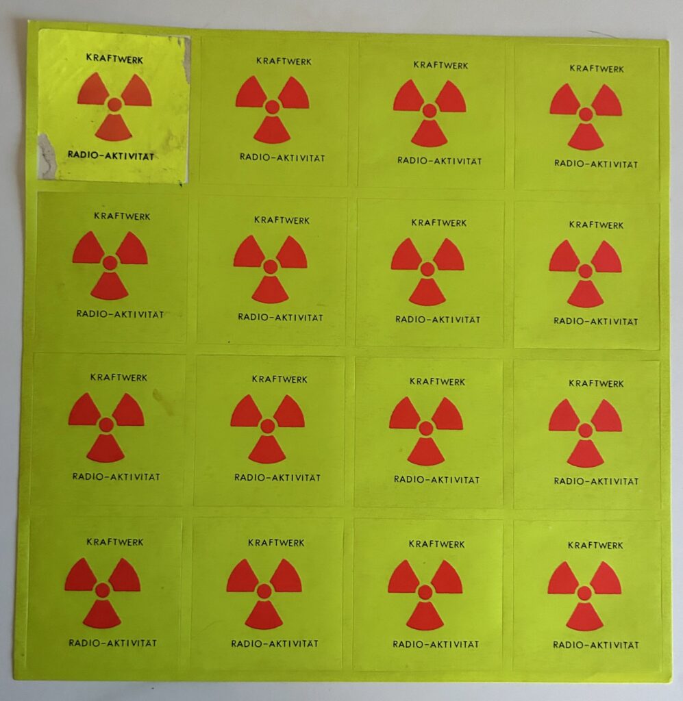
Early pressings of Radio-Activity came with a sheet of bright yellow stickers stamped with the radioactive trefoil, a small but pointed extension of the album’s theme. Kraftwerk were still shaping their visual language, and the stickers worked like a portable hazard beacon, letting listeners tag whatever surface they pleased with the record’s signal. Not every edition included them, which only adds to their charm now. The sheet feels less like merch and more like a clue to how the group wanted the album to live in the world, a quiet reminder that Radio-Activity was built to radiate outward.
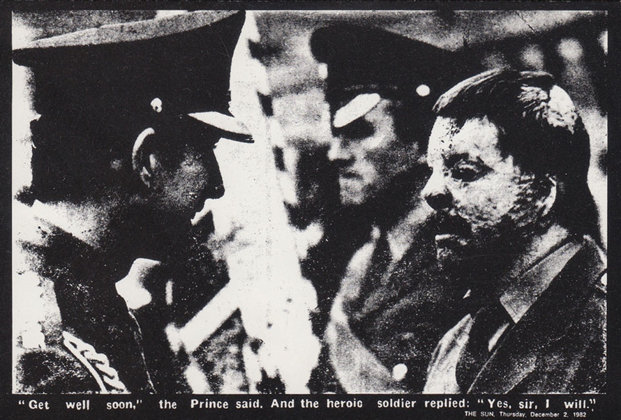
The original LP included a foldout poster centered on one of Gee Vaucher’s most arresting appropriations: a news photograph of Prince Charles leaning toward a soldier whose face and body had been burned beyond recognition during the Falklands conflict. Vaucher didn’t shoot the image. She pulled it from the public record and recast it within Crass’s visual language, turning a royal hospital visit into a stark confrontation between power and the cost of its decisions. Paired with the band’s black-and-white typography, the poster reads like a communiqué and a reminder that the album’s fury wasn’t theoretical. It had a face.

The first pressing of In Search of Space didn’t come with a poster. Instead it included the Log Book, a 24-page booklet created by Barney Bubbles and Robert Calvert that reads like a set of notes from an invented voyage. Diagrams, photos and brief narrative fragments sit alongside the music, giving the record a wider frame without overstating the concept. It’s part manual, part scrapbook, and it anchors the album’s early vision in print. The Log remains one of the more unusual inserts of the era, not flashy but quietly expansive in the way it shapes how the record is received.
The booklet turns the record into something lived, handled and rediscovered. In an age when most listening happens on screens, these stray pieces of paper feel almost like messages from another era, still waiting in the sleeve.
Join us February 17 for the second edition of Record Bizzy at Darling! NYC-based ATO Records will present an exclusive first listening session for Altın Gün’s new album. […]
What happens when a little extra cardboard changes everything. In record packaging, no format carries more weight, physically or symbolically, than the gatefold sleeve. Oversized and deliberately tactile, […]

A look at the artist who fused sound, sex, spirit, and style across decades of iconic album art. Few album cover artists reward gobbling LSD more than Mati […]

Join us at In Sheep’s Clothing HQ this Saturday to dive deeper into the world of X-Cetra. Back in 2003, a handful of tracks from a remarkably odd […]

For our next Art & Design in focus, we highlight the work of Maja Weber, wife of German bass icon Eberhard Weber. Arguably the most iconic series of […]

Explore one of the most fascinating collections of dance music ephemera on view now at SF MOMA until August 18th. As vinyl collectors, we’re all well aware of […]