


Transparent clarity, deep bass, and “Invisible Sound” from German audio company ADS. Background: One of the lesser known hi-fi brands of the ’70s, ADS (Analog and Digital Systems) […]

If you were lucky enough to be a music freak who could also illustrate, in the 1960s and ‘70s you could actually earn a living from working the hi-fi magazine circuit. After all, there are only so many ways to photograph a Marantz, McIntosh or JBL component, and with advertising money pouring in art budgets were fat.
Because of the nature of advertising and magazine work, the names of many of these for-hire illustrators have been lost to time, but their loving, occasionally cheeky depictions of gear and the listeners getting lost within it endure.
Below, a few illustration highlights from Stereophile, High Fidelity and other glossy magazines of the era.
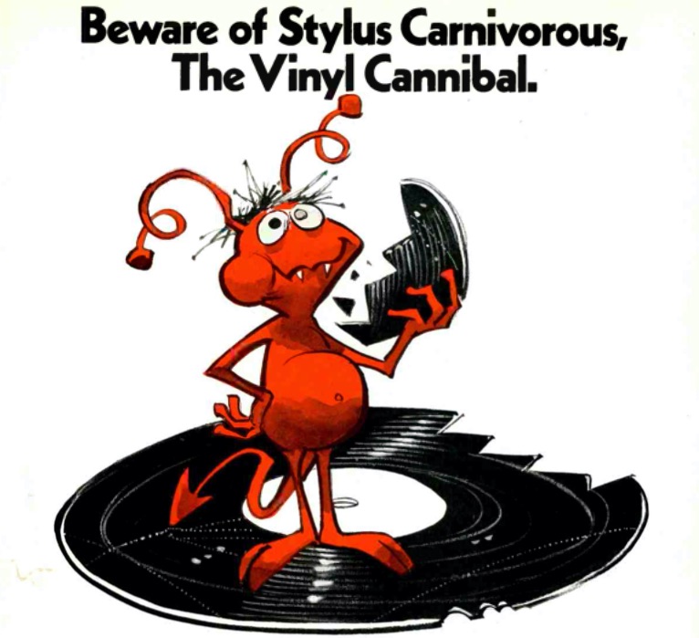
Taken from a 1977 advertisement for Pickering cartridges and styli, this illustration identifies “Stylus Carnivorous,” a pest that “may look cute but he’s a nasty little creature. He shows up when the stylus in your phonograph begins to wear.”
The early 1970s saw the arrival of the first successful mass-market format since the LP: the cassette. Before its adaptation by component makers, cruising music was dictated by radio DJs. Cassettes changed the game, and the result was a huge push in the marketplace.
One of the major innovations of the golden hi-fi era was in stereo separation and amplification. Hellbent on exploring the capacities and engineering potential of room-filling sound, writers reported on innovations — and illustrators tried to capture ways of manifesting those ideas.
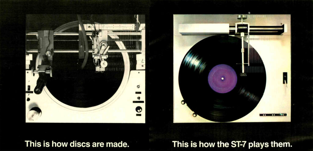
Mixing photos and illustrations, Harman Kardon’s 1977 ad for its straight line tracking turntable the ST7 explains through similar images why the technology was deemed superior when it was introduced. The market spoke, however: few manufacturers make linear tracking turntables anymore.
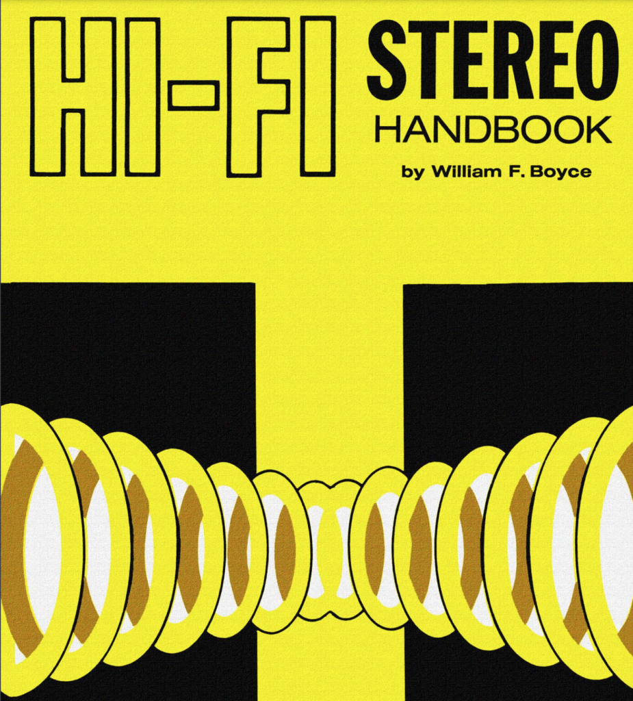
If you look closely at the cover to this primer on hi-fi, you can see the canvas upon which the anonymous illustrator painted the original. With bold colors and a simple, brilliantly conveyed idea, the image pops off the page.
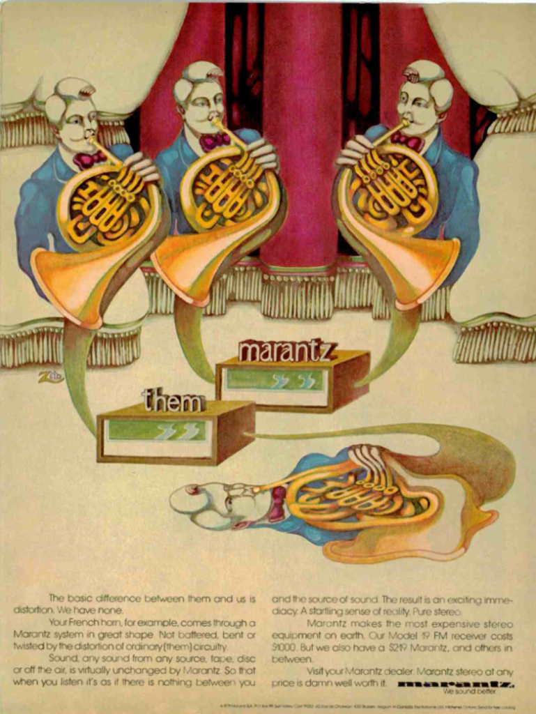
By the mid ‘70s, Marantz was so successful that they could apparently commission artists to drop a lot of acid, put on some tunes and start painting. This 1975 ad compares its competitors’ flat sound to Marantz’s more hallucinogenic energy.
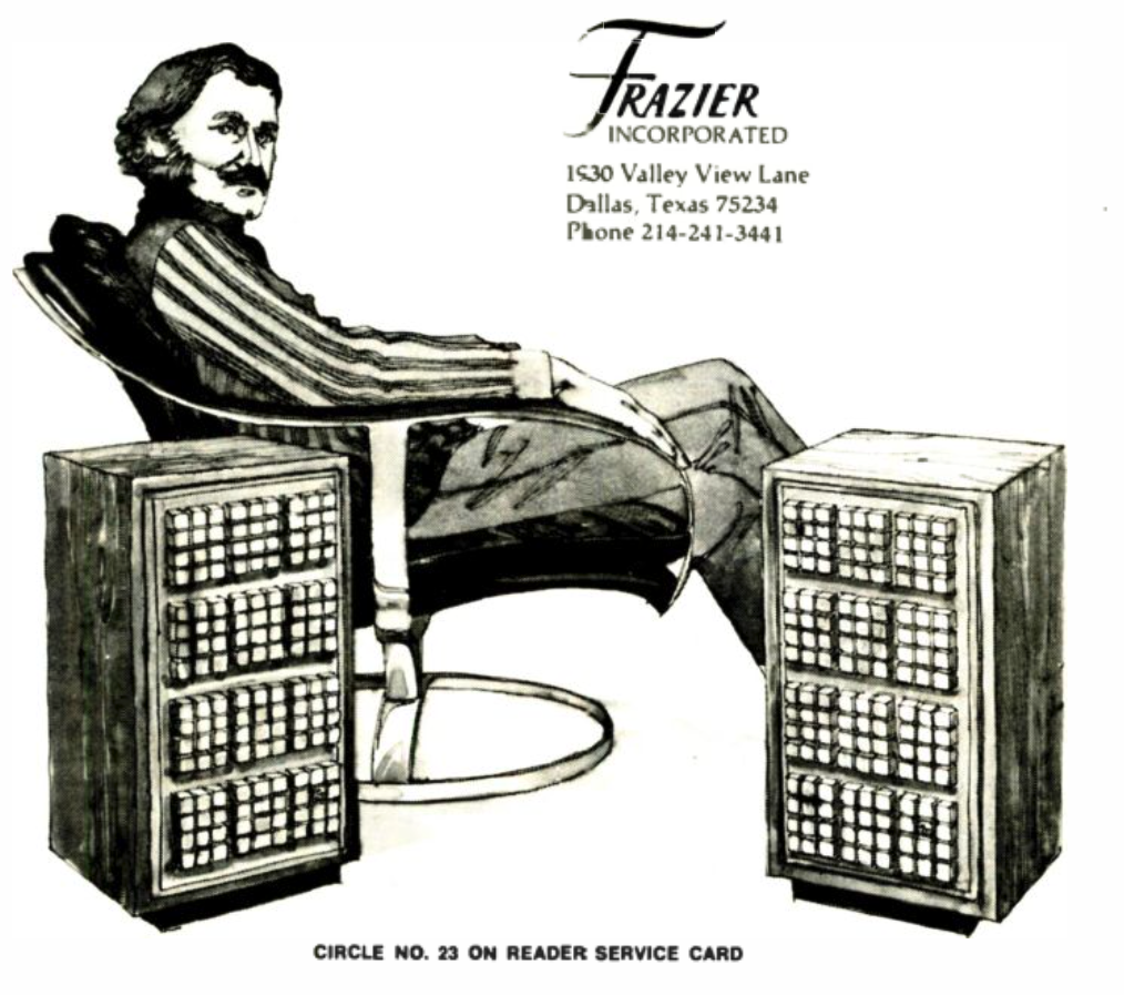
Who is this man, and why does he look like he’s getting ready to go bartend at a saloon? Why isn’t he sitting in front of the speakers? Whoever he is — and where are the speaker wires? — the ad campaign didn’t hurt. Frazier Inc. is still in business making boutique speakers, part of Mitchell Acoustic Research.
Transparent clarity, deep bass, and “Invisible Sound” from German audio company ADS. Background: One of the lesser known hi-fi brands of the ’70s, ADS (Analog and Digital Systems) […]
Join crucial selectors for curated delights on a killer system at our Sound & Vision shop in DTLA. No single statement better encapsulates In Sheep’s Clothing’s mission and […]
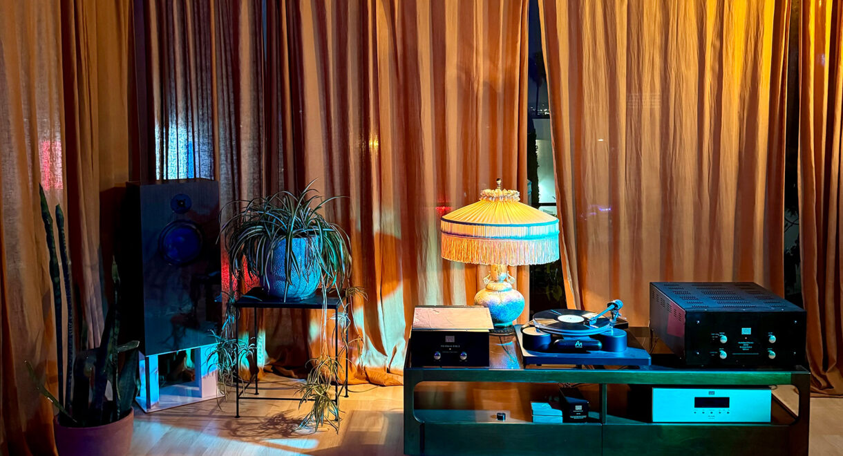
We’ve set up an Audio Note system in Hollywood and recently interviewed company founder Peter Qvortrup. Here’s Peter Qvortrup, founder of the respected British gear manufacturer Audio Note, […]
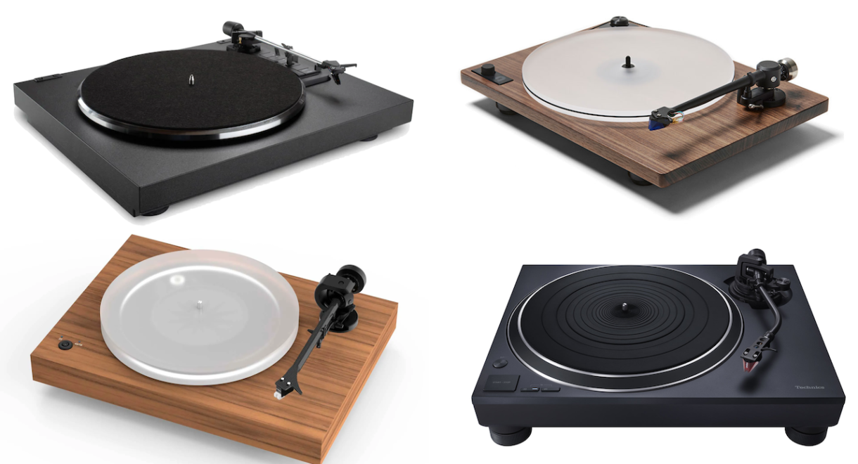
Looking for your first high-end audiophile turntable but don’t want to spend more than $2,000 for something that will be your deck for many years to come? Are […]
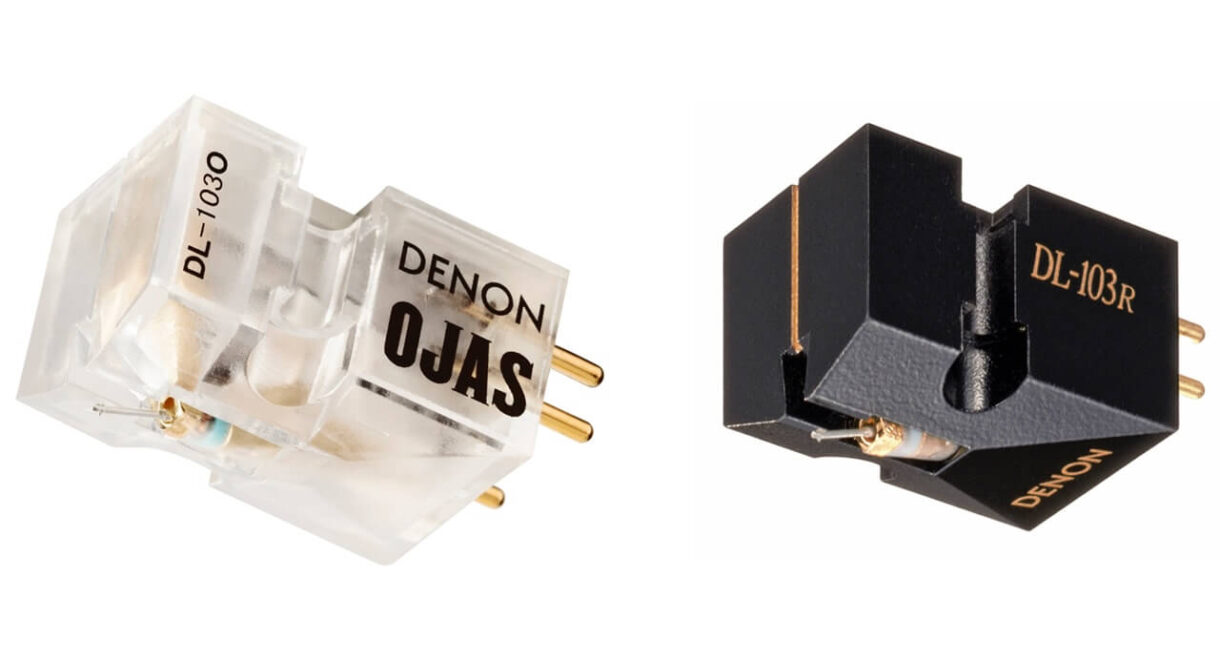
In collaboration with Devon Turnbull, the Denon DL-103o moving coil phono cartridge contains a DL-103R in a stylish clear case. Denon has teamed up with Devon Turnbull of OJAS, […]

“The city of Yokohama is an indispensable part of the story of Japanese jazz.” Featured in Philip Arneill’s Tokyo Jazz Joints book, DownBeat is one of the classic […]